5 Stylish Ways to Add Contrast and Transform a Room
5 Stylish Ways to Add Contrast and Transform a Room
When people hear the term 'contrast' they sometimes mistake it as solely a play on light and dark tones. And while that is part of the definition, there are actually many more ways for designers to add contrast to a space. Our team here at Archant is passionate about sharing techniques that make for great design. In this article, we’re looking at five of the most stylish approaches to contrast including texture, colour, materials, shape, and accents.
Is your design lacking the wow factor? Is it a bit short on that visual appeal and sense of drama? It’s in these spaces that contrast can be used to transform a room. The concepts we’re covering are not limited to any one part of the house. In fact, they can be applied to commercial spaces with great success as well. Rather than merely talking about the theory behind the process, we’re also noting specific products which can help you accomplish this refined aesthetic.
By the end, you’ll have a deeper understanding of how to use contrast to create visual interest in your design. Whether you want to define a space, capture the viewer’s eye, or feature a specific element in a room, contrast is a key aspect of great interior design.
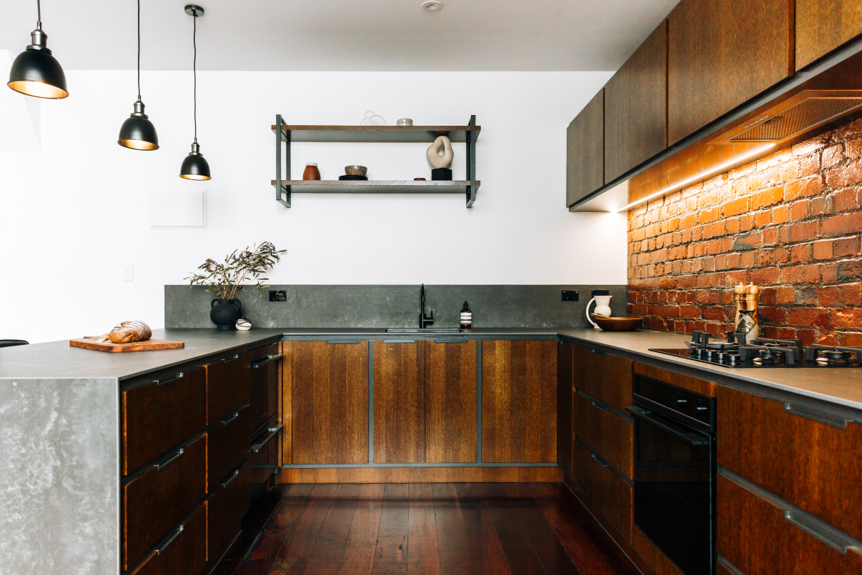
1) Incorporate Texture with Wire Mesh
If you’re wondering why texture is important in interior design, it helps to think of it in terms of visual weight. For example, a painted wall has a much different texture than a wire mesh surface. When paired together, the textural contrast creates depth. This can make a space more dynamic by adding a touch of sophistication and style. Of course, this is just one of a wide range of potential variations.
Many Interior Designers in New Zealand are already using our exclusive wire mesh product Wovenpanel® to completely transform spaces both big and small. This unique decorative surface allows for the ultimate creative expression and customisation. Choose from different finished, weave patterns, and mesh opacity to get the specific look and feel you desire.
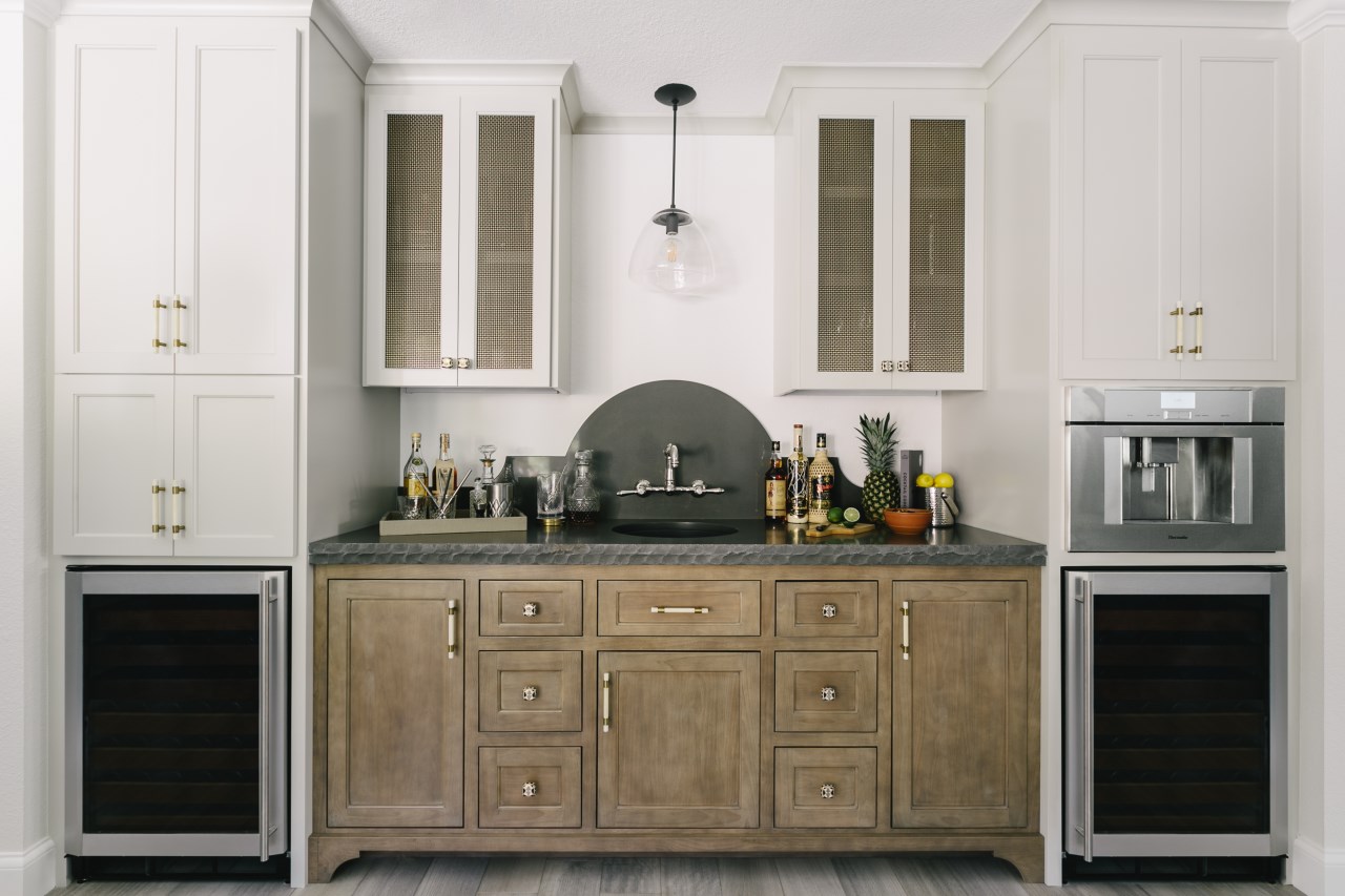
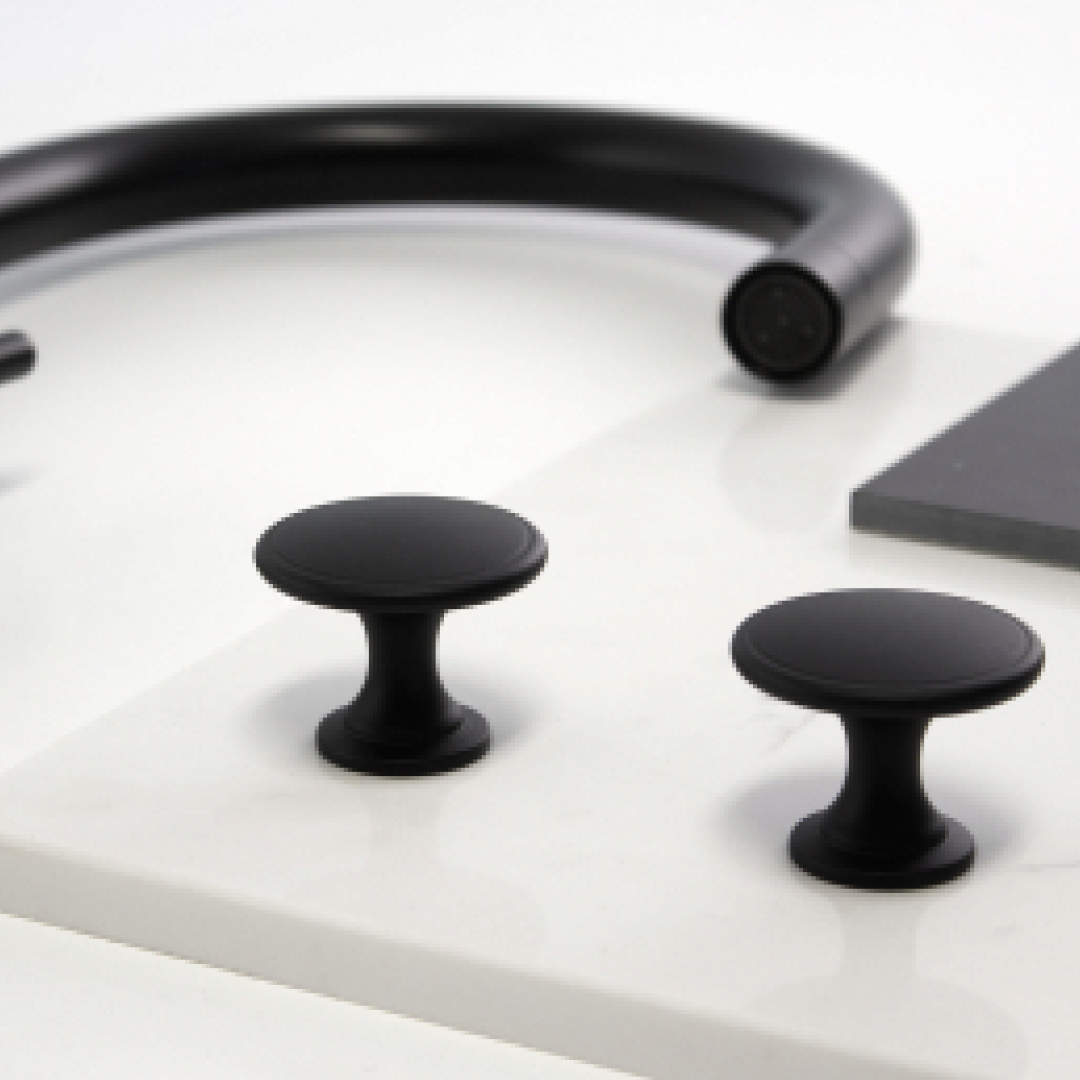
2) Add Colourful Accents with Stylish Handles
When used sparingly, contrasting elements are often more visually striking. For this reason, the hardware you choose for your cabinets and drawers offers a great opportunity to enrich the design. Part of the reason this is successful is the subtle nature of the application.
If you’re unsure of how many accents to use, consider the 60-30-10 rule. This long-standing interior design principle suggests that 60% of a room should feature the main colour, with 30% as the secondary colour, and the remaining 10% as the accent colours. Of course, in any creative endeavor, rules can be broken, but these guidelines are a great starting point to consider.

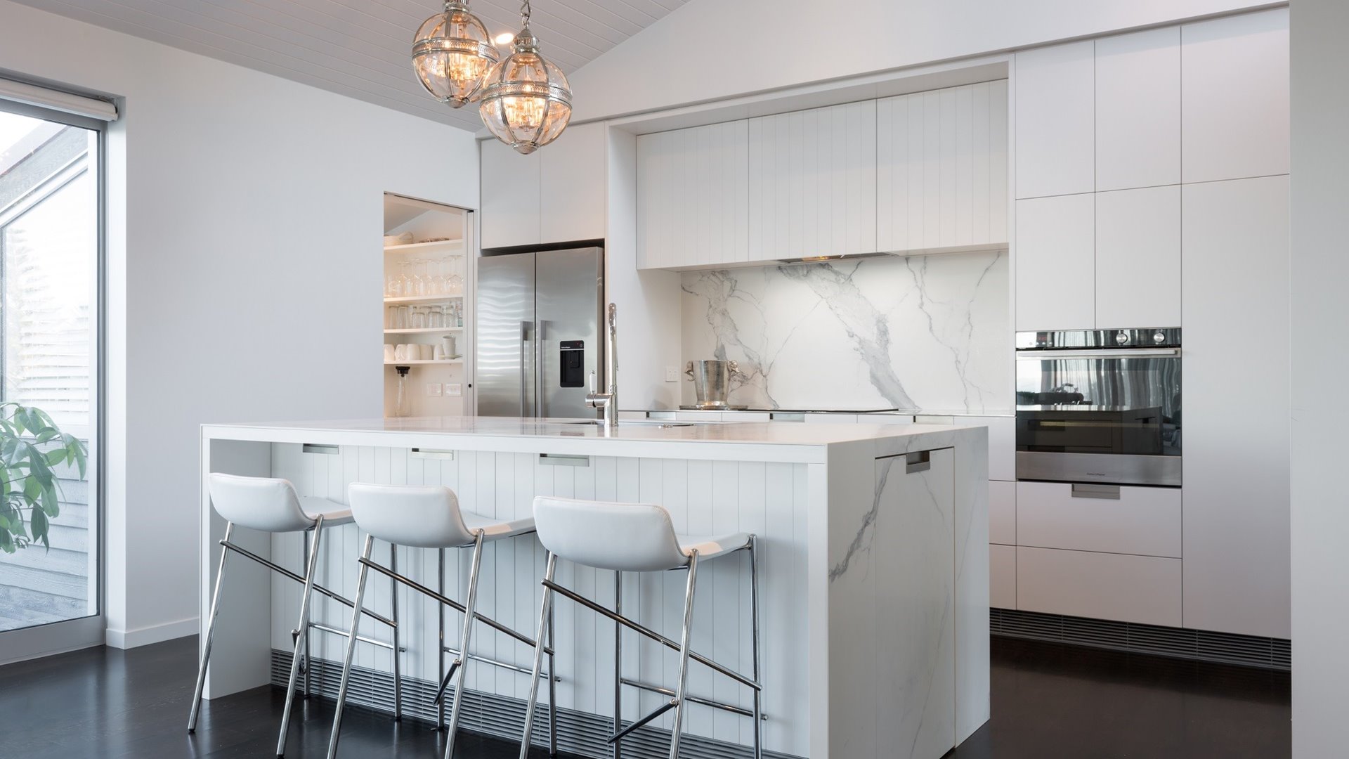
3) Leverage the Patterns of Porcelain
To infuse a room with more personality, consider leveraging different patterns into your space. Do you want something bold with abundant movement, or something more delicate and understated? Ideally, the patterns you choose will reflect your personal sense of style.
At Archant, we have a vast array of porcelain surfaces to choose from with scores of patterns. These large format slabs are not limited to just benchtops, but also walls, floors, splashbacks, and more. With tones that range from light to dark, it’s easy to find a stone that will contrast beautifully with your colour palette.
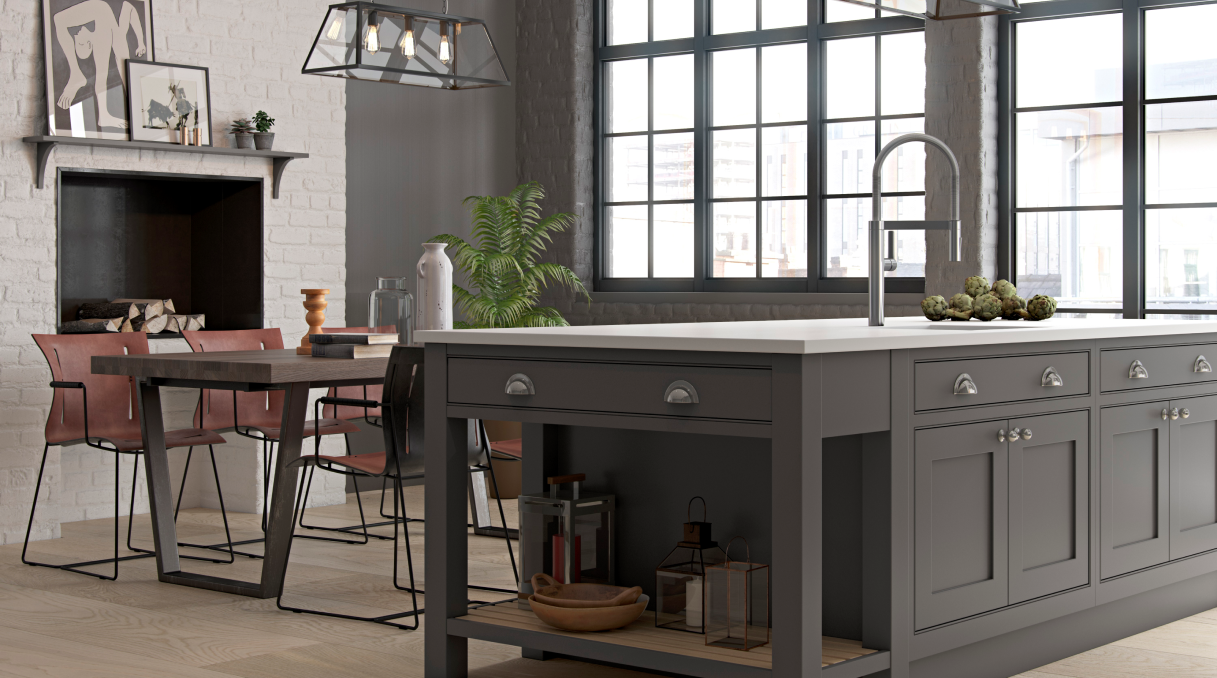
4) Mix and Match Shape and Scale
Another simple way to add contrast is to mix and match various sizes and shapes. For example, we recently highlighted a project that combined the diamond patterns of our knurled brushed brass handles with a tight weave and closed mesh pattern of Wovenpanel® in the same finish. And while these two products were similar, the different scales and application types worked together to emphasise the textured effect.
By combining shapes and sizes that are opposite to each other, such as linear handles and round knobs, the eye will be drawn to the contrasting elements. This is a great opportunity to craft the unique look you envision so don’t be afraid to experiment.
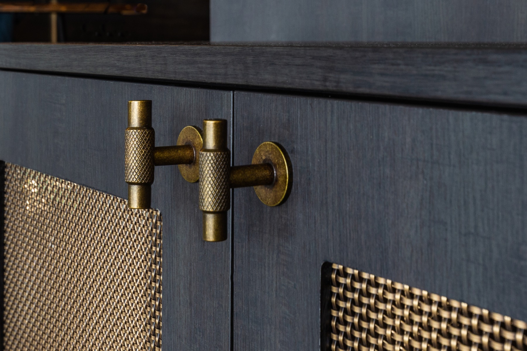
Photo by Val Burns Photography
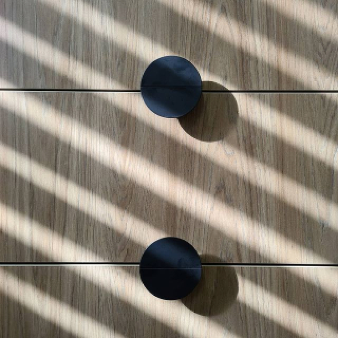
5) Work with Highlights and Shadows
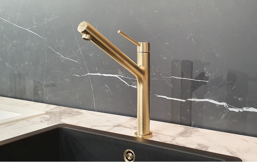
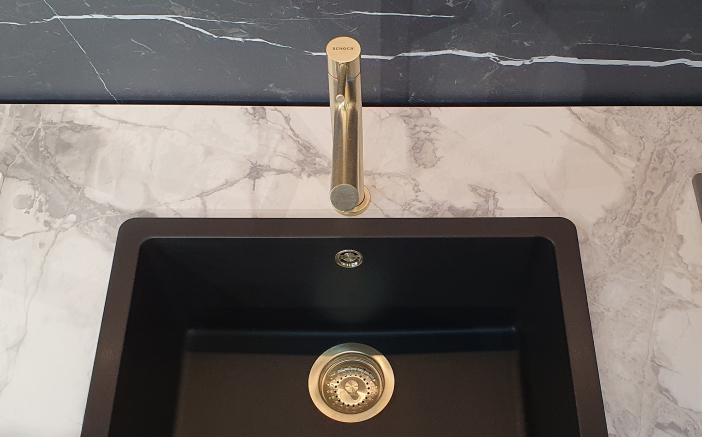
It can be helpful to think of contrast from a monochromatic perspective. From black to white and all the shades of grey in between, these tones can be used to enhance the space and catch a viewer’s eye. Predominantly lighter rooms will benefit from small details of darker elements. Likewise, dark spaces can benefit from small pops of lighter tones.
Take a step back and look at the overall space. Is there an opportunity to incorporate this idea into your project? Don’t forget about details like the sink and taps. In fact, many of our Eco Granit bowls are available in black and white for this exact reason as are many of our taps. When set against the opposing tone, the results are truly striking.

How Will You Use Contrast in Your Design?
Choosing any one of these methods will add contrast to your design, but more importantly, they add a dynamic energy to a room. And while these five methods above are tried and true, we encourage you to break these rules to create your own look. Be sure to tag #archant in your best design photos on Facebook and Instagram. We look forward to seeing how you use contrast to transform your space.
Related Links
5 Luxurious Ways to Upscale Your Kitchen Design in New Zealand
Why You Should Consider Using Wire Mesh in Your Design
How Much Should I Budget for My Kitchen Renovation in New Zealand? (Pricing Guide)
The Problem with Small Kitchens and Solutions to Improve Them (A How-To Design Guide)
How to Choose the Right Handle Style and Shape for Your Kitchen